My Role
UX/UI Designer and UX Researcher
2 weeks
Project Time
Client
Student Project at General Assembly
OVERVIEW
The overarching challenge of the project was to create a conceptual cloud-based web app for video games.
-
It should be noted that this project was conducted during a UX design immersive course through General Assembly.
-
Furthermore, it was conducted in a collaborative effort with three other designers: Raini Vargas, Daniel Lee, and Alicia Faivre.
The Challenge
We noticed that the biggest problem with cloud-based gaming was that our users enjoyed low-latency gaming experiences that allowed them to interact socially with their friends. Currently, cloud-based technology does not allow games that are graphically intensive to run smoothly in a cloud-based setting.
Our solution was to create a cloud-based gaming platform that provided classic-retro games from the NES and Sega consoles of the 80s, 90s, and early 2000s.
user research
Key Takeaway #1
Users enjoy gaming as a way to socialize with friends.

Key Takeaway #2
Almost all users refuse to play on the cloud due to the fact that modern games, that are graphically intensive, experience latency issues.

Key Takeaway #3
Users find FPS to be the most important factor when gaming - cloud-based gaming this causes high latency, or lag, issues.

Key Takeaway #4
Users grew up playing video games that came out during the late 80s and early 90s, or the classics.

empathizing with gamers
After synthesizing the insights from our interviews we were able to create 2 user personas. The first, Blaze, is our avid gaming enthusiast. The second, Fahmi, is our user who plays games casually.


Market research
Task Analysis
The key takeaway:
-
Gaming services need to provide users' with an intuitive sign up process to get from log-in to gaming as quickly as possible.

Feature Analysis
For our competitive analysis, we chose three different platforms from the task analysis to gather insights from a wider variety of systems.
-
This was to ensure we did not overlap our analyses on the same companies in order to gain a better understanding of current features and issues.

information architecture
For the information architecture, I chose a site map that felt familiar to our users as well as reflected the research we had done. Other cloud based platforms and PC retailers have minimal primary navigation with a the majority of content being found under sub-navigations.

Style Guide
Color Theory

To keep in line with a retro/80s vibe we drew inspiration from the design aesthetic known as vapor wave with initial colors being pink and teal. However, we were afraid of accessibility issues so we went with neon yellow and teal.
Buttons
For our buttons, we chose to have the bright neon yellow serve as our primary CTA with the dark blue serving as our secondary CTA.

Font & Text Styles
-
We chose Press Start 2P for our headings and titles - it is also the font largely used for 80s and early 90s video games.
-
Acme was chosen for our supplementary font to serve as our body texts
-
Complimented Press Start 2P
-
Easier for reading.
-

Initial iterations

Home Screen
-
For the Home Page, we wanted to emulate Netflix for user familiarity.
-
Added a hero image of our brand that we created.
-
Cards for game titles of most recently played games.
Product Page


-
On the Product Page we used Steam as our design inspiration.
-
Combined Hero Image of the game and the community hub into one game detail page to showcase community engagement with the game itself.
-
This was to provide new players with a brief view into what they could experience within the game.
Game Library


Initially wanted to incorporated a playlist style system based on user preferences inspired by Spotify. However, we eventually took out the playlist because it did not fit the overall aesthetic of our app.

final designs

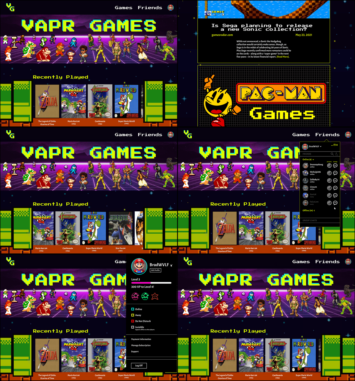
Home Screen
Modeled the overall app after modern PC video game retailers for quicker access to the games users love.
-
Latest news window
-
Controller set-up instructions for users.
-
Recently Played
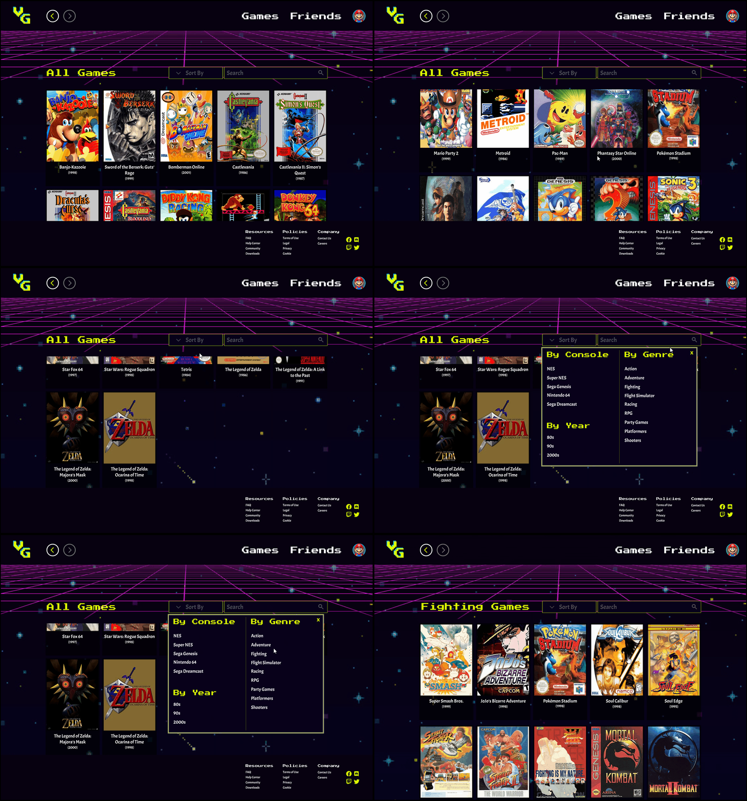
Game Library Page
-
Organized the library alphabetically for intuitive browsing.
-
Implemented a sort by function and search bar for filtering after user feedback in usability tests


Product Page
For the horizontal scrolling "similar games" we added our Mario tunnels aesthetic to match the home screen.
Mobile Remote
As part of our project's guidelines, we were required to build a conceptual mobile-remote design that would "interact" with our web app/website.

-
The concept I designed was based around the NES and SNES controller
-
Needed to provide compatibility for both 2D and 3D controls - chose to implement dual-joysticks.
-
Joysticks were positioned for where people's thumbs naturally lie on the phone screen.
-
-
This was to make it familiar for users currently while also providing a similar feel to the older NES controllers.
Next Steps
-
If I had more time, I would add additional consoles such as the PlayStation 1 and possibly the Nintendo GameCube.
-
I would also look at creating a feature that allowed a way to link Discord to the app.
Conclusion
Learnings
Some of the things that went well for this project was team collaboration. Our ability to talk through our research findings, synthesize it properly, and come up with our design decisions was an awesome experience. Furthermore, the research phase was a fun challenge for me. I personally know a lot about gaming so I had a lot of assumptions about cloud-based gaming already. This project gave me the chance to practice throwing out all of my assumptions and taking the perspective of a user who knows little about gaming in general.