Client
Student Project at General Assembly
My Role
UX/UI Designer and UX Researcher
Project Time
2 weeks
Overview
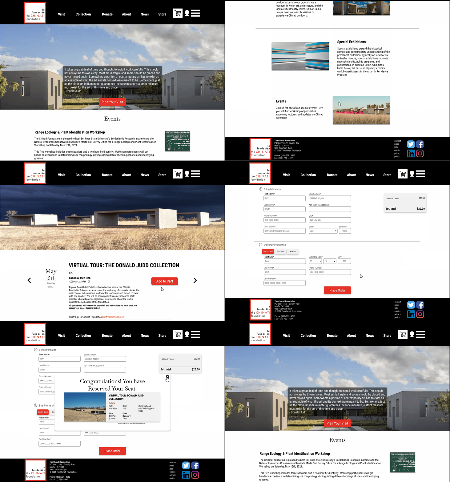
For this project, we were tasked with creating an e-commerce platform for a small business in Marfa, TX. The objective was to provide a way for businesses to continue to provide services for the community during the pandemic. I chose to come up with a conceptual redesign of the Chinati Foundation's website - an art foundation centered around the collective works of Donald Judd.
The Challenge
The key issue was that the Chinati Foundation needed a way to promote their permanent collection, art workshops and events that allowed for staff and visitors to interact with one another - the solution was to create a virtual experience of their guided tours and workshops that helped to promote the foundation's mission.
Learning the art process and how others view art
In order to fully grasp the problems facing artists in a digital marketplace, I needed to find out their process in how they make and display their art to the public. Through three user interviews I was able to gather key insights into these processes and local artist views on art as a whole.

Key Insights
-
Most artists seem to be aware of the large need for a community
-
Social media is the primary means of getting their art visibly seen quickly and effectively.
-
Artists mainly go to galleries for inspiration/to view other art - don't go expecting to purchase anything.
Finding the middle ground between artists and art enthusiasts


The challenge here was finding a middle ground that addressed the needs of the art enthusiast and the local artist strictly in the digital sphere. I chose to create a conceptual virtual guided tour experience since this covered the needs of both users' as well as helped to promote Chinati's mission.
Market Research


To gain an understanding of the process users' would take when signing up for a virtual experience I chose to compare task flows and current features of other art foundations and museums.
The research showed that the best process for a virtual tour would have an intuitive sign up process, accessible information, and a streamlined checkout process.
Restructuring the current site navigation

I decided to keep the original navigation the Chinati Foundation website but conducted a small amount of content chunking to reorganize the structure of their navigation. The key areas were the added About section where I moved their current research information and mission statement. I then combined the Donate and Support sections into one page due to the content on both dealing with cash donations.
Ideation
Homepage


The start of my ideation phase was focused on their homepage. Primarily, the hero image took up too much space and pushed their important content down toward their footer.
-
To fix this, I shrunk the hero image, added current events and news, and added artists in residence to the page to provide more information quickly for users' to find.
Store Page


Created a bootstrap card layout similar to Amazon and Netflix for user familiarity of an online store.
Virtual Tour Page


For the virtual tour page I needed inspiration for the design. I decided to emulate the San Diego Art Museum's virtual information page but moved their button locations for users to quickly find the CTA.
Style Guide
The overall Style Guide I designed was centered around the logo's design. I felt that the combination of black and white was a good combination and chose to keep red as the primary CTA since it conveyed passion. The overall emotions I wanted visitors to feel was a passion for the purity and elegance of natural art.


Final Design

Virtual Tour Page
Focus was to have users land on the page and immediately transition toward the Visit page where they could book their virtual tours.
Donation Page
For users' that enjoyed their visit to the foundation they could quickly navigate to the Donation page.
-
Added an other amount text input field for users to have agency in the amount they were donating


Store Page
Provided horizontal scrolling for users to know that there is more to the page.
-
Added a search bar for users who knew specifically what they wanted.
onwards & upwards
Learnings
This project taught me a lot about the entire design process. This was my first official UX project where I came to understand that asking questions and feedback from others is vital for working through roadblocks during a projects lifespan. Without the support I had from others I would have continued to overthink the solution to my problem and inevitably would have hit a scope-creep issue.
Next Steps
-
Moving forward, I would like to incorporate a local artist posting board where local artists could post the local art unique to Marfa, TX.
-
Look at the data from the virtual tours to see which collection is performing the best.
-
Also, find out which days people tend to book the most to promote days that are not as busy/have more availability.
-